Posts Tagged ‘Photography

01
Nov
10

Photo Composition Basics

When you look through the camera viewfinder, you are framing the world, you are choosing what is in the frame (and what is not) and how everything will fit together. Whether you realize it consciously or not, in releasing the shutter, you are actually making many decisions that affect how the image will look. There are various guidelines for composition, but no set rules as each photographic composition is a very personal thing. Avoid deciding on a rule first then shooting. Elements in a scene may not lend themselves to certain rules. Let what you see through your viewfinder guide you and keep in mind your main subject. Certain subjects naturally lend themselves to the use of a particular rule. Composition guidelines such as the rule of thirds, rules of odds or the Golden Ratio offer thoughts on placement of the main subject, while these rules are a great way to interpret and discuss balance, established photographers and keen amateurs alike do not necessarily think about them at great length when composition images in the field while some compose great images intuitively without much thought at all. Having said these, rules are made to be broken, conforming to these rules will increase your chance in achieving a better visual balance and thus a great picture but There is no guarantee. It goes without saying that many great pictures do not adhere to any of these rules.

Visual weight

– composition is about making the elements within your frame seem in balance with one another. Look at the visual weight of each element in turn. Colour, contrast, shape, brightness or texture all attract attention differently when they are viewed individually or in totality on an image. A red flower against a green lawn will attract attention; it has visual weight due to the contrast of colours.

Balance

it is almost certain that a photographer has to adjust the position of objects within the frame according to the visual weight. If you place a right white element on the edge of the frame, our eyes will be attracted to it and the get drawn out of the frame. on the contrary, if the bright white element is now in the centre of the frame, our eyes will be held on the image and the whole picture will feel more balanced.

Types of Balance

a) Symmetry – the simplest balance is symmetrical. this is where the point of interest is in the middle of the frame and there is nothing wrong placing the subject right in the middle of the frame.

b) Asymmetrical balance – This is where the points of interest are off centre.

Rule of Thirds

– A good guideline when positioning subject off centre is the rule of thirds; this is because human eyes are naturally drawn to a point about two thirds up a page. It is basically a quick and easier variation of the Golden Section Rule (more of this later). Instead of using the Golden ratio, the picture is divided into 9 equal sections by 2 horizontal and 2 vertical lines. The frame is divided vertically and horizontally into thirds. In the same way as in the Golden Section Rule, the elements are placed on these lines, the subject or the most significant parts of your photograph is positioned along any of these lines preferably at the points where the lines intersect. This gives practically the same basic effect since this positions are very near the positions in a Golden Section. Many photographers use the Rule of Thirds because it is much easier even for amateurs to determine or estimate and a lot of cameras nowadays are already equipped with grid lines that fall on the same places as the lines used here.

Rule of Odds

– It claims that images are more visually appealing when there is an odd number of subjects. It may not be practical in shooting a group of people but odd numbers work well in composing still life and perhaps foreground subjects in landscape images.

Golden section rule

– One thing that plays a part in making a photograph that is pleasing to the eyes is the spacing, or the position at which the subject lies in the picture. Architects use the “divine ratio” or the “golden ratio” which has a value of 1:(1+√5)/2 or 1:1.618034 as a basis for making naturally appealing structures as it has been proven that anything in nature that we find beautiful, uses this ratio. It seems to flow naturally and is always appealing to the human eye.

In photography the golden ratio is also used as a basis for a well composed photograph. The Golden Section Rule states that the eye is naturally drawn the points that lie within this ratio in a photograph. In order to achieve this, the picture is divided into 9 unequal but symmetrical parts with 2 horizontal lines and 2 vertical lines as guide. The distance from the top to the first horizontal line must be in a golden ratio against the distance from this line to the bottom of the picture. The same goes to the distance of the bottom horizontal line to the bottom of the picture against the distance of this line to the top of the picture. The same must be followed for the vertical lines.

Placing your subject along any of these lines, specially on the intersections, makes it more naturally attractive to the viewer. These intersections are sometimes called “Power Points”. For portraits, the eyes of the subject are often positioned along one of the horizontal lines preferrably near one of the power points to make the photograph more pleasing to look at. For landscapes the horizon is aligned to any of the horizontal lines depending on which part is the focus of the photograph. If you want to capture the sky, align the horizon to the lower horizontal line. If you want to show the field or the sea, then align the horizon on the upper horizontal line.

Golden Spiral Rule

– This is a subdivision of a Golden section rule, it helps you create a very fluid an naturally flowing photograph. It is the same rule that makes the photographs of a spiral staircase or a nautilus shell look so pleasing. The uses are not limited there though as you can always use it on objects on a scene that has a sense of increasing significance towards the subject, like the petals towards the center of the flower, or curled body of a cat towards it’s eyes. With this rule, the frame is divided along the longest side using the Golden ratio. The resulting smaller section is again divided the same way on the long side with the smaller section continuously rotating by 90 degrees every time. This process is repeated until the resulting rectangle is too small to be significantly divided further. The point where the smallest rectangle lies is the “Power Point” where the subject should be positioned. Following the direction where the resulting rectangles are positioned, a spiral may be drawn connecting the outer corners and this line is used as a guide for the rest of the objects in the scene.

Rule of space

– The rule of space probably comes naturally to you and most do not even know it is a rule of composition. The rule of space means that in order to portray movement, context and the idea that the photo is bigger than just the part that you’re seeing, you need to leave clutter free ‘white’ spaces. For example if you’re photographing a runner, give him a space to run into. Don’t photograph him with all the space in the world behind/above/below him because this doesn’t help the viewer  picture the forward motion. If you’re making a portrait of a woman laughing at something not in the photo, leave space in the direction where she is laughing. This leads the viewer to wonder what is just beyond the boundaries of the photo.

Viewpoint

–  The point of view is the most basic of composition rules. Many photographers get into the habit of always shooting their images from the same height i.e., at eye level or tripod. Thus missing out many great images. A view angle can be used to create compelling composition to a photo. By choosing unusual angle of view, one can create a composition that is something out of the ordinary. So, shoot high, shoot waist high, shoot low but just keep shooting. You will soon discover that a simple familiar objects appear differently when view from a different angle.

Perspective distortion

The availability of different lens type gives the photographer a whole host of composition options. A good example is the ability to zoom in or out from a subject without changing position.If the subject is located far from the camera position, the normal tendency for a photographer is to “zoom-in” or use the telephoto end of a zoom lens if it is available, rather than moving closer to the subject. Of course there is nothing wrong with this method, in fact telephoto lenses are made precisely for this reason. The same goes to using Wide Angle lenses to capture more of the view of a scene rather than moving away from it. The use of telephoto and wide angle lenses, however, have significant effects on the proportion of the background to the subject. This is called Perspective Distortion and it affects both the wide angle and telephoto lenses.

Using telephoto lenses causes a Telephoto Perspective Distortion. It is not the lens that causes this distortion but this distortion only happens as a result of using lenses with long focal distances. If the distance of the subject from the camera is big enough, the use of a telephoto lens to make them appear closer will cause the objects that are near the subject to look bigger than normal as though they are on the same distance as the subject. This makes them appear to be side by side with each other or closely piled up.

A Wide Angle Perspective Distortion results when you use a wide angle lens to widen your view of a scene. This distortion is caused by the short distance between the camera and the subject and the compressed scene behind the subject will tend to make the background objects to look smaller than normal. The closer the subject is from the camera, the more this distortion becomes evident. A typical case would be using a wide angle lens on a closeup portrait of a very near subject. Parts of the subject that are nearest the camera like the nose, will appear unnaturally larger as if it has swollen.

Depending on the situation, these distortions can be disastrous to your photos as it can cause abnormal proportions to the objects or it can drive away the attention of the viewer to the wrong places in the photograph. On the other hand if properly controlled and utilized, these distortions can help you create a more artistic dimension to your pictures

Leading Lines

– are lines or objects that make up a line within a scene that is used to direct the attention of the viewer. Use leading lines to draw the viewer’s eye through the photograph towards the subject or the area which is the most significant in the scene.

Look for any natural or man-made structure within the scene such as roads, shadows, edges of a cliff, or buildings that can be used to point towards the subject. The lines may start anywhere from outside of the photograph but the most effective leading lines are those that start somewhere in the bottom and flows towards the main subject. The lines may be straight or curved. Straight lines produce a rather aggressive and dynamic effect while curve lines gives the picture a more gentle and calm feel.

Diagonal Rule

– states that a photograph looks more dynamic if the objects fall or follow a diagonal line. The diagonal line doesn’t have to be an actual line and it doesn’t have to be a straight one. It could be the edges of a river, the top of a forest, or even an imaginary line connecting the different objects in the scene. More specifically, create three diagonal guides by marking the vertical edges of your screen 1/6th of the height from the top and 1/6th from the bottom. The same way mark the horizontal edges 1/6th of the width from the left and 1/6th from the right. Connect the upper left horizontal mark with the lower right vertical mark, the upper left vertical mark with the lower right horizontal mark, and the upper left corner with the lower right corner. You may also use the opposite corner combination if you want the opposite diagonal lines. By placing natural elements that form a line along these diagonal guides makes the picture more pleasing and dynamic. If there are no imaginary or real diagonal lines that can be seen within a scene, sometimes a simple change of position or elevation is enough to produce a useful angle on the objects in the scene. A sufficient amount of Perspective Distiortion from a wide angle lens may also help.

Another way Diagonal lines generally work well is when it is acting as leading lines, to draw the eye of an image’s viewer through the photograph. They create points of interest as they intersect with other lines and often give images depth by suggesting perspective.

They can also add a sense of action to an image and add a dynamic looks and feel.

Consider how you might use diagonal lines to lead the eye to your photograph’s main subject or point of interest.

Different studies have been done into how people view images and many of them say that a natural way into an image is by traveling left to right and so a diagonal line starting at the bottom left and moving to the top right of an image can be quite useful and natural.

02
Oct
10

How To Be A Good Critiquer


came across this article in a forum,
By Lois Wakeman

People use forums both for sharing their experiences and pleasure at capturing an image, and to get feedback on their work. Both purposes are equally valid, but it helps everyone to know why an image was posted. This both avoids any unintentional offence, and saves everyone time.

If you’re shooting for your own enjoyment, then it really matters little whether anyone but you likes your photos. You may want to be as technically proficient as you can but from a subjective or aesthetic standpoint, it may matter less. If, however, you’re shooting with the intention of selling or displaying to a broader audience, either now or in the future, then a more subjective perspective is valuable. In order to sell a photograph, it needs to be able to appeal to a wider variety of tastes and artistic appreciation.

To help people appreciate your work, and to get good feedback, you need to:
include all relevant technical info about the image: film, shutter speed , aperture, lens, filters, tripod, etc,
tell everyone the kind of critique you want so you are neither told what you already know, nor blinded with jargon. (E.g. beginner, knowledgeable, professional, technical comments only, artistic comments only.)
explain if there is anything particular you want help with,
and it can sometimes be helpful if you share some of your feelings when you took it, or give details of an effect you wanted to achieve.

This facility can also be a great learning tool, if people would like to provide demonstrations: selected examples of their best work with a detailed technical and creative description of the way they set it up, and any special techniques in post- processing.

Comments on the impact, the look, the feel, the design/composition, etc. of an image are very subjective. Not everyone is going to like everything you shoot and vice versa. As a result, for non-technical issues, remember to take them in the manner intended, which is most likely trying to be helpful, and don’t let it get under your skin or discourage you. On the other hand, you may find that someone suggests a fresh viewpoint or technique that has never occurred to you, and will be invaluable in developing your style.

Notes for Critiquers

First of all, remember that a critique is (or should be) a thoughtful, reasoned response to a photograph – and it can be positive, as well as pointing out any defects. Critique does not mean criticism! That being said, a well articulated negative comment can sometimes be an illuminating moment for the photographer; conversely, being told that there is nothing wrong can be a good confidence builder.

(Honest feedback is a useful aid for the photographer to learn and progress: if no-one points out possible problems, we all carry on doing the same thing forever, instead of working out ways to improve. Some varying ideas will allow the photographer to pick and choose those that will help develop his/her own style.)

Second, remember that you are trying to help people improve their skills – not to puff up their egos or destroy their self-confidence. Try to balance any perceived problems with an appreciation of the good points of the image. That way, you will get a better reaction from the photographer, and perhaps encourage more useful discussion from other members.

If you point out a problem, see if you can offer some constructive help on how to fix it for next time, by choosing a different viewpoint, aperture or shutter speed for example. Do not assume everyone knows as much as you do, so explain in simple terms how to fix what you may see as obvious: not everyone understands the relationship between aperture and depth of field. (Even if the photographer is knowledgeable, other people hoping to learn from the critiques may not be.)

On the other hand, do not be put off making a critique just because you are not a technical expert: anyone who can see can form an opinion of an image and tell the photographer what they like and dislike about it. Since it is very hard to be objective about your own work, the reactions of fresh eyes can be really invaluable.

You will probably find that critiquing helps you to improve your own photography too: by analyzing what works and what doesn’t, you will learn new techniques and approaches you can use.

While you are free to respond to other people’s critiques, and it is perfectly valid to disagree, you should of course exercise courtesy and restraint in doing so: remember the primary purpose of the forum is to help photographers improve. Sometimes, a simple apology for unintentional offence may be diplomatic, however unreasonable you may feel the response to be.

Checklist for Critiquing

Here are just some things to think about: if you don’t understand the technical aspects, then just concentrate on the others, which are equally valuable.

Technical Aspects:

Is it in focus where it needs to be (including appropriate use of depth of field)? For example, although landscapes are traditionally expected to be sharp, soft focus and a narrow depth of field are quite appropriate for certain subjects. And for macro shots, the part of the subject in focus is really critical.

Is camera shake evident? (You cannot always tell the difference between shake and mis-focusing, but overall blur in a twilight shot is often subject to it.)
Is the color balance right? (Unnatural color casts may indicate the wrong film or digital white balance was used.)
Is the exposure right: can you see details from shadows to highlights, or are bright parts washed out for example? Is the overall impression very gloomy or too bright (taking the subject into account)?

Was a good choice of lens used for the subject? (focal length: wide angle to telephoto; fisheye, macro…)
Was a good choice of film / digital technique made: grainy monochrome, supersaturated color, infra-red…) – or has the photographer used an inappropriate filter or special effect to beef up what would otherwise be a really boring shot?

For JPEG images, are there any obvious artifacts, typically caused by oversharpening or excessive compression?

Artistic Aspects:

Is the composition visually satisfying, or static, or just plain inept?

Is your eye led around the frame in an interesting way by use of layers, curving or intersecting shapes, diagonals, repeating themes, symmetry/asymmetry etc?

Is there a discernible subject? (Does there need to be one for this shot – not always necessary for a “tone poem” type landscape for example?)

Is there a good balance between the subject and the background? Beginners often chose a safe, middling approach by getting the subject more or less to fill the frame, where a more distant shot including context, or a close-up of a detail, would be more compelling.

Have any important parts of the subject been lopped off at the edge for no reason?

Conversely, would a better crop have eliminated unnecessary areas and improved the image? Beginners often present full frames regardless, and rarely think to turn the camera 90 degrees for a better result.

Has the photographer missed some obvious problems with the subject: litter in a tree, a fence post sprouting out of a figure’s head, unwanted object in the foreground etc?
Is the horizon level, for sea-, river-, and lake-scapes? And for architecture shots, is any perspective distortion considered, or accidental?

Does the photo tell a story, show a scene, record an event, or in some way evoke a memory or feeling? Or does it make you imagine the photographer saying ‘Whoops, I just pressed the shutter button’?

Don’t get too hung up on the rules of good composition – part of having a good eye is in knowing when to break the rules. Not every shot of a tree by a lake needs to conform to the rule of thirds, nor does every bird portrait need to be inclusive of the whole creature, or a head and shoulders looking at the camera.

Just because you may be bored with seeing (for example) sunsets with palm trees, boats with reflections, or macros of bugs on yellow flowers, that doesn’t necessarily mean that the person who took this photo is. We all have to start somewhere, and what is common to you is fresh and exciting for someone else. Instead of pointing out that it is formulaic, suggest a way to lift it above the ordinary. If you can’t, then concentrate on the photo technique, not the subject, in such cases.

Emotional Aspects:

Does the subject speak to you, and evoke some reaction other than a yawn?

Sometimes, the impact of a powerful piece of photojournalism or a stunning scene can outweigh minor technical problems, and conversely, a beautifully executed shot can leave you quite cold.

Tell the photographer how you felt about the photo: it is impossible to be really objective about one’s own work, so third party opinions are invaluable, as we have already said.

And finally, enjoy your photography

22
Sep
10

Advanced Sharpening Technique – Easy Steps:

Advantage : affects only the detail of the image and not the colour (since it is held in the a and b channel), hence less noise.

1) Open your image in Photoshop.

2) Go to Image>Mode and select ‘LAB Color’. (In default, you should be editing your image in RGB mode.)

3) Now that you’re editing your image in LAB colour mode, go to Window>Channels to open your channels window.

4) Now that your channels window has popped up, you should see 4 different channels: Lab, Lightness, a & b. Select the ‘Lightness’ channel.

5) Go to Filter>Sharpen>Unsharp Mask. Use an Amount of 300%, Radius 0.8 and Threshold 1. Your image should look very much oversharpened at this point, but fear not.

(Try setting the radius at the resolution of your image divided by 200, if the resolution is 600 dpi then the radius  should be set at 3, 600/200)

6) Go to Edit>Fade Unsharp Mask and keep the mode at ‘normal’. Adjust the opacity with the preview box ticked (around 60-70% should give you adequate sharpening). Choose your favourite level of sharpening and click ‘OK’.

7) Now go to Image>Mode on your toolbar and switch back to ‘RGB Color’.

Doesn’t this feel great?

15
Sep
10

Single or Constant auto focus

Two modes determine the way in which the auto focus system works on your camera. In single mode, when the button is pressed halfway the lens focuses on the main subject. If the user wishes to change the point of focus then they need to remove their finger and repress the button. In this mode, if the subject moves, you must refocus.

The  constant or continuous focusing  mode focuses on the subject when the shutter button is half pressed, but unlike the single mode, when the subject moves, the camera will adjust the focusing in order to keep the subject sharp. This is sometime called focus tracking. Some AF SLR systems have taken this idea so far that they have ‘pre-emptive’ focusing features that not only track the subject but analyse its movement across the frame and try to predict where it will move.

Each mode has it’s uses. SIngle focusing is handy if you wish to precisely focus on a zone into which the subject will appear. Constant is more useful for subjects that move more randomly especially in sport photography.

17
Apr
09

I give you Gif animations in CS3

I have always wonder how to make a simple gif animation using simple jpeg files. 

Here’s how.

sample

    Choose 2 or more sample pictures, I have here a woman that was transformed instantly with SK-III, a pre and post photos.


step 1 Go to the top menu, File>Scripts>Load Files from Stack.


Step 2 Once the files are loaded, go to Window>Animation


Step 3  Before you do anything else, it is important that you set some parameters for your animation. Click on the option button at the upper top right corner of the animation window (see below). For this exercise, I have set the total duration to 2 seconds and frame rate at 1 fps.

                               step 4


   picture-51To begin stitching the frames together, you must first highlight all the photos in the palette well by Shift + click


step 6 


 Then click on the option button on the animation window and select Make Frames From Layers

step 8    


We are almost there, once an animation is created, you can use the playback button to check the transition and frame rates.

Once you are happy with the result, go to Save for Web and from there, you can choose the resolution that suits your requirement.

End result

old

18
Feb
09

I give you perfect White Balance everytime

So, here we are…. February year 2009. Many things have happened since New Year, such as the world is now creeping slowly into recession, unemployment numbers are getting worse, the USA has elected a new President (I have high hopes for this guy but he needs time and 4 years is not gonna be enough) and my baby daughter had grown 2 more milk teeth. Anyway, the year of Ox will hopefully bring better luck to all.

Back to the subject…….

Digital Cameras are getting better and better, but they still cannot compete with human eyes. This is especially true in situations where the lights are tricky to read. For those who are lucky enough to have the opportunity to play with the Adobe Photoshop but too poor to afford a white balance Grey card (How many do you see use one!!), I will show you a neat little trick to get the white balance spot on, time after time!

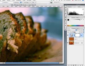
Here is a photo that was taken under halogen lighting, which throws a nasty orange cast to the subject. There are many ways to correct this but they are no where near as simple and as consistent than what I am about to show you, we will try to correct this in less than 1 minutes and that I promise you.

1) Duplicate the photo in your method of choice (and I don’t mean by drawing)


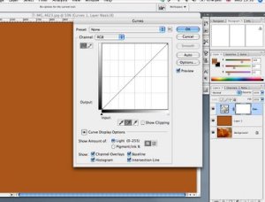
2) Go to the top menu> Filter>Blur>Average, this Average filter is by no mean ‘average’, it determines the average colour of the picture, based on the colour value of each pixel in the image and fills the image window with that colour. By now, the photo will transform into one single colour, in this case, the brown colour. Do not panic!


(In knowing the overall colour, it’s also a good way to determine a suitable border or frame colour.)


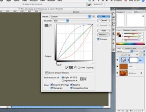
3) Now create a ‘curve’ adjustment layer by clicking on the adjustment icon on the layers palette.

4) Select the handpicker in the middle to set the grey point, then click anywhere on the middle layer. This will transform the brown colour into 50% Grey.


5) Now, turn off the middle layer and the original background photo will now have the correct white balance.


It really is ‘a piece of cake’, agree?

Tips

No PS tricks are set in stone, your imagination is the limit.
Once you have created the corrected curve adjustment layer, just drag and drop onto other photos that were taken under the same lighting.
You could create an action for this, but this is already so simple…
For those who prefer shooting jpeg, you can still use Adobe Camera Raw to open your photo and correct WB if you wish, just change the settings in the PS.

Caution

This method will not work if you are trying to capture the lighting condition associates with sunrise/sunset.


May 2024
M T W T F S S
 12345
6789101112
13141516171819
20212223242526
2728293031